Histogram
The Histogram panel calculates the distribution of values and visualizes them as a bar chart. The Y-axis represents the count of values in each bracket (bin), while the X-axis shows the value range.
Add Histogram Panel
Navigate to Dashboards
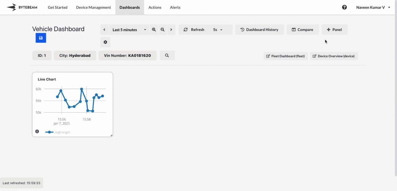
Go to the Dashboards tab, select the desired dashboard, and click on the + Panel button to create a new panel.
Select Histogram Panel
Choose Histogram Panel from the list of available panels.
Configure General Settings
In the General tab:
- Title: Add a title for the panel (optional).
- Stream: Select the data stream to use.
- Field: Choose the column whose data will be used to create the histogram.
- Number of Bins: Adjust the slider to set the number of bins (brackets) for classifying the data.
On hovering over a bar, the range of values within that bin will be displayed.
Submit the Panel
Once all configurations are complete, click Submit to add the Histogram Panel to the dashboard.
The histogram will now display the data distribution in bar chart format, allowing for easy visualization and analysis of the data.