The Gauge Chart Panel is designed to display a single data point in the form of a gauge, providing an easy-to-read visual representation of the data’s current value relative to defined thresholds. This panel is ideal for visualizing metrics where you need to track performance within a specific range, such as system health, resource utilization, or other indicators that can be represented by a progress bar or dial.

You can set minimum and maximum threshold values, and the gauge will dynamically adjust based on the value of the selected metric, giving you a clear indication of whether the metric is within the desired range.

Add Gauge Chart Panel

1

Navigate to Dashboards

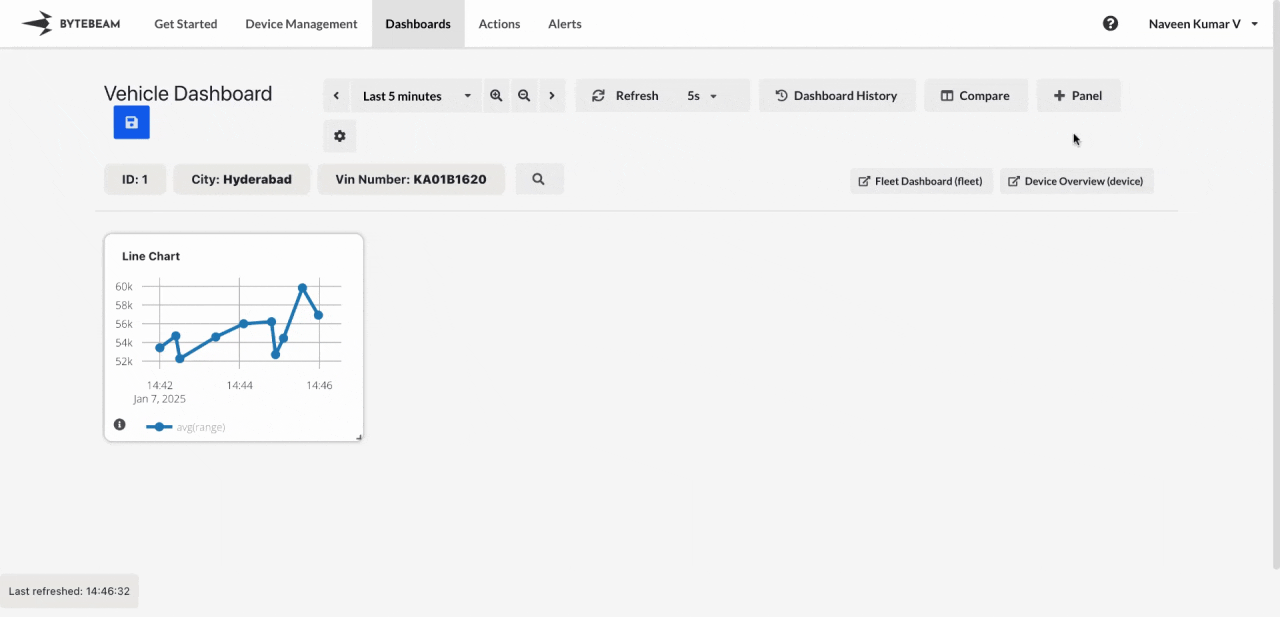
Go to the Dashboards tab, select the desired dashboard, and click on the + Panel button to create a new panel.

2

Select Gauge Chart Panel

Choose Gauge Chart Panel from the list of available panels.

3

Configure General Settings

You will be presented with options to configure:

  • Title: Add a title for the chart.
  • Min Threshold: Set the minimum value for the gauge.
  • Max Threshold: Set the maximum value for the gauge.
  • Stream: Select the data stream for visualization.
  • Field: Select the specific field or column to display.
4

Customize View Settings

Switch to the View tab to adjust the appearance of the gauge chart:

  • Percentage Value: Enable this to see the percentage value instead of the actual value for the chosen column.
  • Start and End Colors: Customize the start (low value) and end (high value) colors for the gauge.
  • Divisions: Adjust the number of divisions in the gauge for a finer or coarser scale.
  • Show Units: Optionally display units for the value being measured.
5

Submit the Panel

After completing the configurations and customizations, click Submit to add the Gauge Chart Panel to the dashboard.
The gauge chart will now appear on the left side of the screen.