Overview
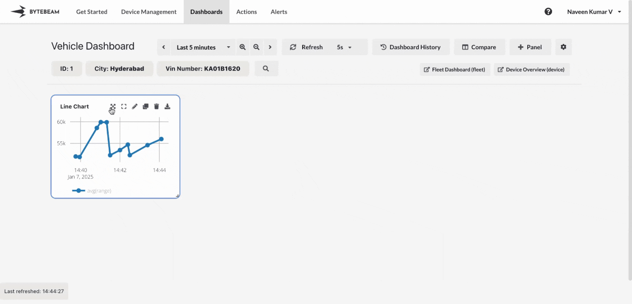
Panels are the building blocks of dashboards, allowing users to visualize specific data streams in various formats, such as line charts, last value displays, time series graphs, or device locators. Each panel is customizable and represents a focused view of a particular metric, enabling users to track real-time or historical data effectively.Panel Operations
 Following operations can be performed on panels:
Adding a Panel:
Adds the selected panel from the list of panels with the chosen details like stream, column etc.
How to use: Click the + Panel option, choose a panel from the list, fill in the required details, and submit.
Viewing a Panel in Full Page:
Opens the selected panel in a full page, providing a focused view of its data and functionality.
How to use: Hover over the panel and click the View Full Page icon.
Viewing a Panel in Full Screen:
Expands the panel to fill the entire screen, ideal for presentations or detailed analysis without distractions.
How to use: Hover over the panel and click the View Full Screen icon.
Editing a Panel:
Allows customization of panel settings such as changing the stream, changing the view settings etc. to meet specific requirements.
How to use: Hover over the panel and click the Edit icon.
Cloning a Panel:
Creates a duplicate of the panel, enabling users to reuse its configuration in the same dashboard.
How to use: Hover over the panel and click the Clone icon.
Deleting a Panel:
Removes the panel from the dashboard when it is no longer needed, helping to keep the layout organized.
How to use: Hover over the panel and click the Delete icon.
Downloading Panel Data:
Exports the data displayed in the panel for offline analysis or sharing in formats such as CSV or XLSX.
How to use: Hover over the panel and click the Download icon.
Following operations can be performed on panels:
Adding a Panel:
Adds the selected panel from the list of panels with the chosen details like stream, column etc.
How to use: Click the + Panel option, choose a panel from the list, fill in the required details, and submit.
Viewing a Panel in Full Page:
Opens the selected panel in a full page, providing a focused view of its data and functionality.
How to use: Hover over the panel and click the View Full Page icon.
Viewing a Panel in Full Screen:
Expands the panel to fill the entire screen, ideal for presentations or detailed analysis without distractions.
How to use: Hover over the panel and click the View Full Screen icon.
Editing a Panel:
Allows customization of panel settings such as changing the stream, changing the view settings etc. to meet specific requirements.
How to use: Hover over the panel and click the Edit icon.
Cloning a Panel:
Creates a duplicate of the panel, enabling users to reuse its configuration in the same dashboard.
How to use: Hover over the panel and click the Clone icon.
Deleting a Panel:
Removes the panel from the dashboard when it is no longer needed, helping to keep the layout organized.
How to use: Hover over the panel and click the Delete icon.
Downloading Panel Data:
Exports the data displayed in the panel for offline analysis or sharing in formats such as CSV or XLSX.
How to use: Hover over the panel and click the Download icon.
The download option is available only for specific panels such as Line Chart, Timeseries Table and Logs panels.
Panels
Following are the available panels in Bytebeam dashboard:Line Chart
Visualize trends over time with line charts to monitor metrics like sensor readings, performance, or usage statistics for your devices or fleet.
Last Value
Display the most recent data point from a selected field to track real-time updates for key metrics.
Gauge Chart
Use gauge charts to represent single data points visually, such as battery levels or system health, with customizable thresholds.
State Timeline
Monitor the state changes of devices over time with a clear visual timeline, ideal for tracking operational modes or device behavior.
LED
Indicate active or inactive states for devices or components with LED-style panels for quick visual feedback.
Aggregate Value
Display aggregated values like sum, average, or count to summarize key metrics across devices or data streams.
Locate Devices
Pinpoint the location of devices on a map and navigate directly to their dashboards for more details.
Track Devices
Track the movement of devices over time and visualize their paths on a map for better logistics and monitoring.
Timeseries Table
View detailed data in a tabular format, with filtering and sorting options for precise analysis.
Histogram
Visualize the distribution of values across a range using histograms for insightful data analysis.
Logs
Monitor and filter real-time or historical logs for troubleshooting and system monitoring.
Static Text
Highlight important information or add contextual details with static text panels.
Bar Chart
Represent categorical data visually with bar charts for easy comparison and analysis.
Alerts
Track and visualize triggered alerts, group them, and add aggregates for detailed monitoring.
Sessions
Visualize and analyze session-based data to monitor user activity or device interactions over time.
Iframe Panel
Embed external dashboards or resources directly into your Bytebeam dashboard for seamless integration.
Stream Status
Monitor the activity of data streams across devices in real-time with visual status indicators.
Device Pulse
Monitor the health of devices by visualizing their last heartbeat and categorize devices by thresholds.