Add Bar Chart Panel
Navigate to Dashboards
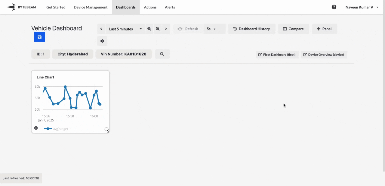
Go to the Dashboards tab, select the desired dashboard, and click on the + Panel button to create a new panel.
Configure General Settings
In the General tab:
- Title: Add a title for the panel (optional).
- Stream: Select the data stream to use.
- Group By Field: Specify the column by which the data should be grouped (e.g., device ID or firmware version).
- Aggregated Field: Select the column you want to visualize (e.g., range, timestamp).
- Select Aggregator: Choose the aggregation method (e.g., average, sum, count).
Customize View Settings
Switch to the View tab to adjust the graph settings:
- Custom Y-Axis Range: Define a minimum and maximum range for the Y-axis to focus on specific data ranges.