Documentation Index
Fetch the complete documentation index at: https://bytebeam.io/docs/llms.txt
Use this file to discover all available pages before exploring further.
Actions V4
We have introduced a new Device Components option, which can be enabled or disabled in the General Settings as needed.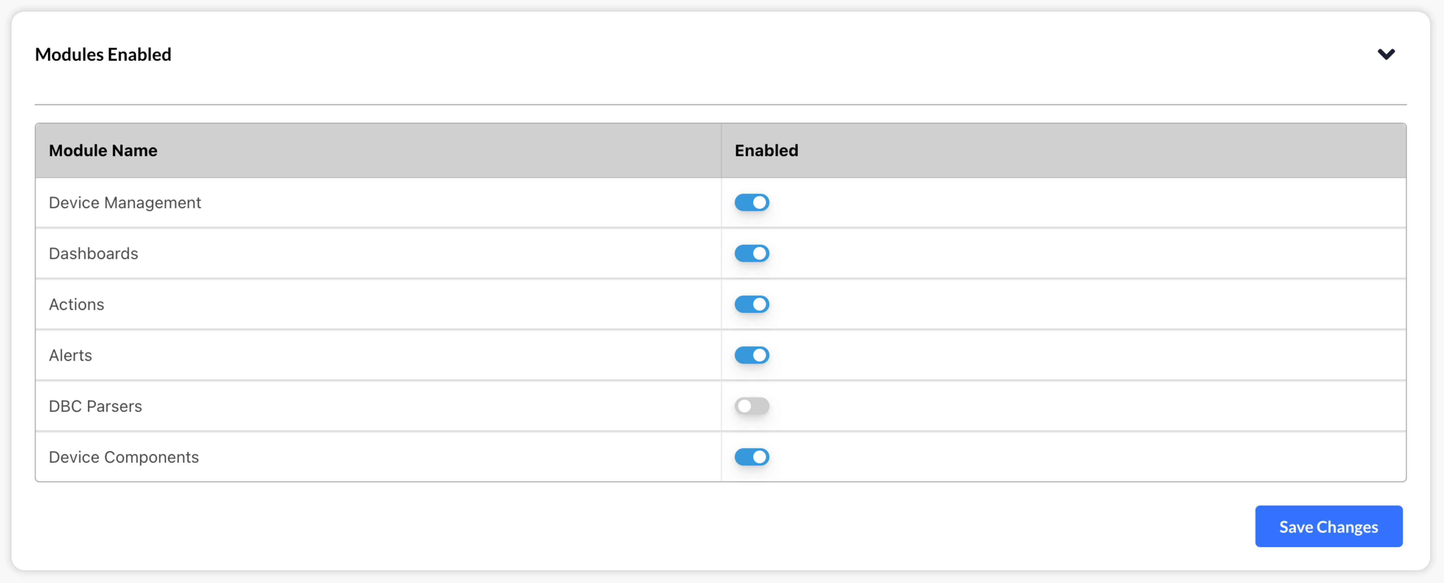
- When enabled, a Device Components section will appear in the Settings menu, allowing you to manage device components by adding, editing, and deleting them.
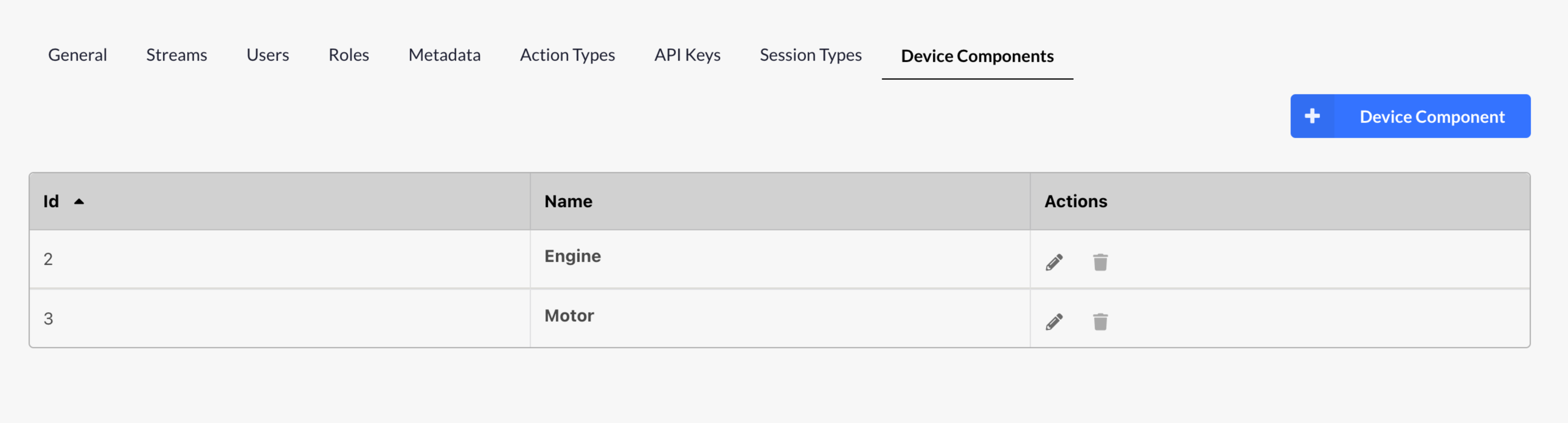
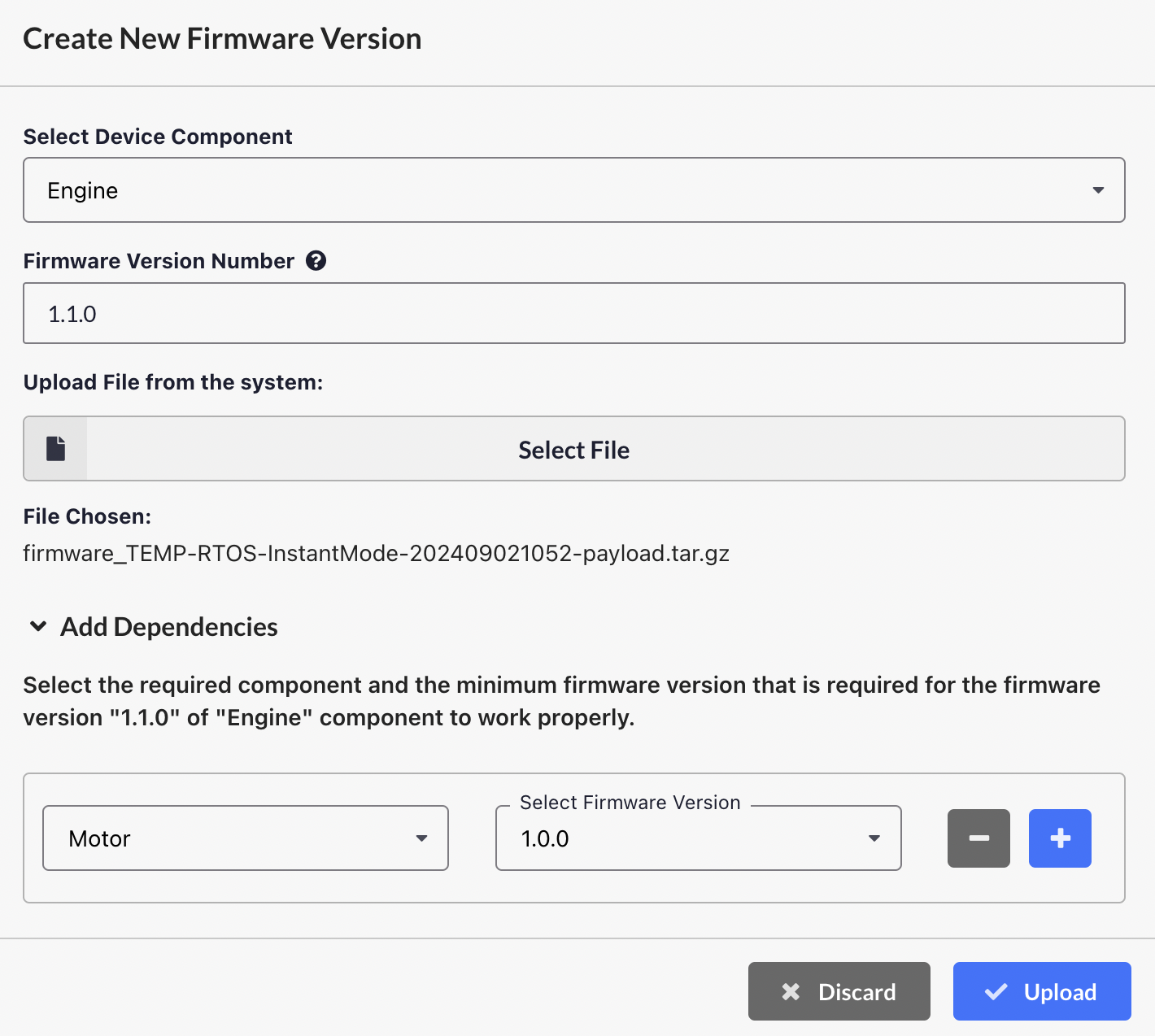
- Enabling this feature will replace the existing firmware versions section with a new Firmware Bundles section. Each added device component will be displayed as a separate tab in the Firmware Files section, where you can upload firmware versions individually for each component.
- You can also specify dependencies for other components during the firmware upload process. Additionally, existing dependencies can be updated or cleared.
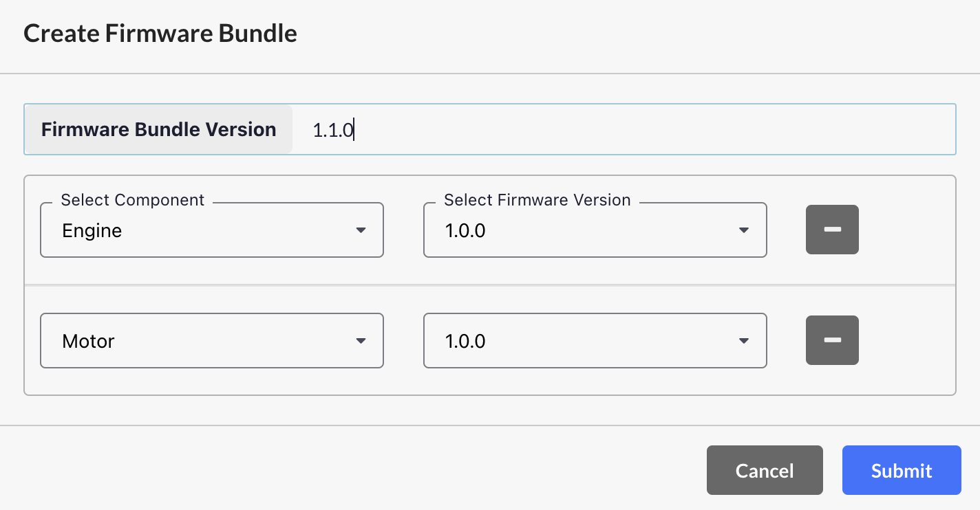
- You can create Firmware Bundles by selecting specific components along with their respective versions, which can be downloaded as zip files. These bundles can also be used to trigger the update_firmware action.
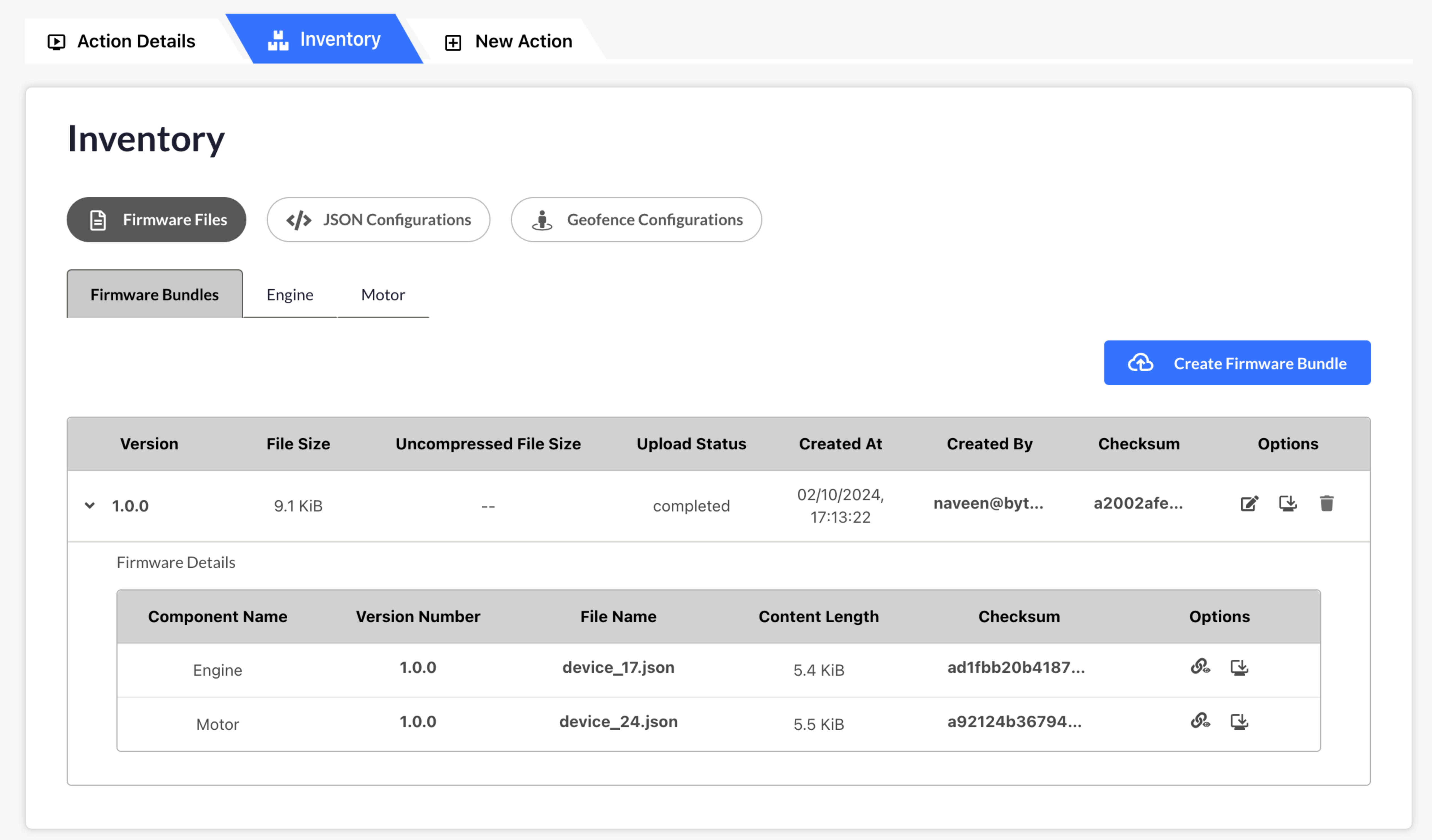
- When disabled, the Device Components section will be removed, and the system will revert to the previous Firmware Files setup.
DBC Update
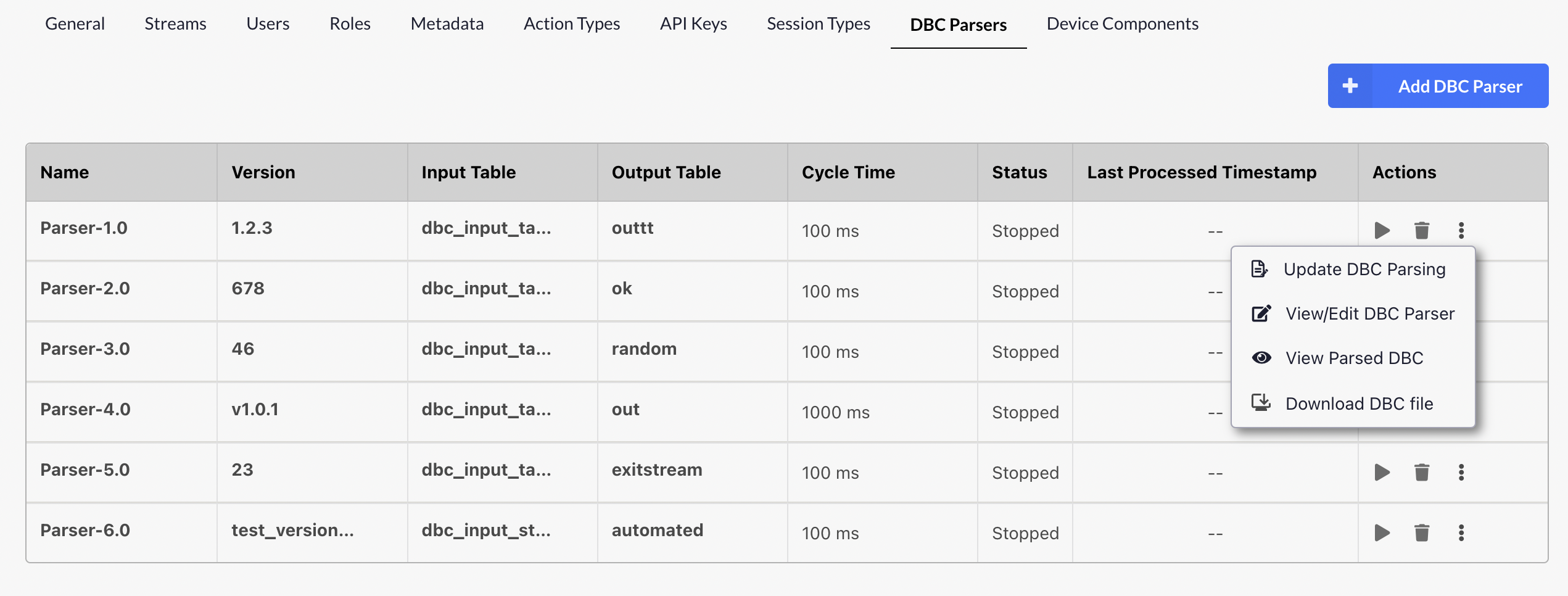
 We’ve introduced a new feature to allow updating DBC files from the platform. Key highlights include:
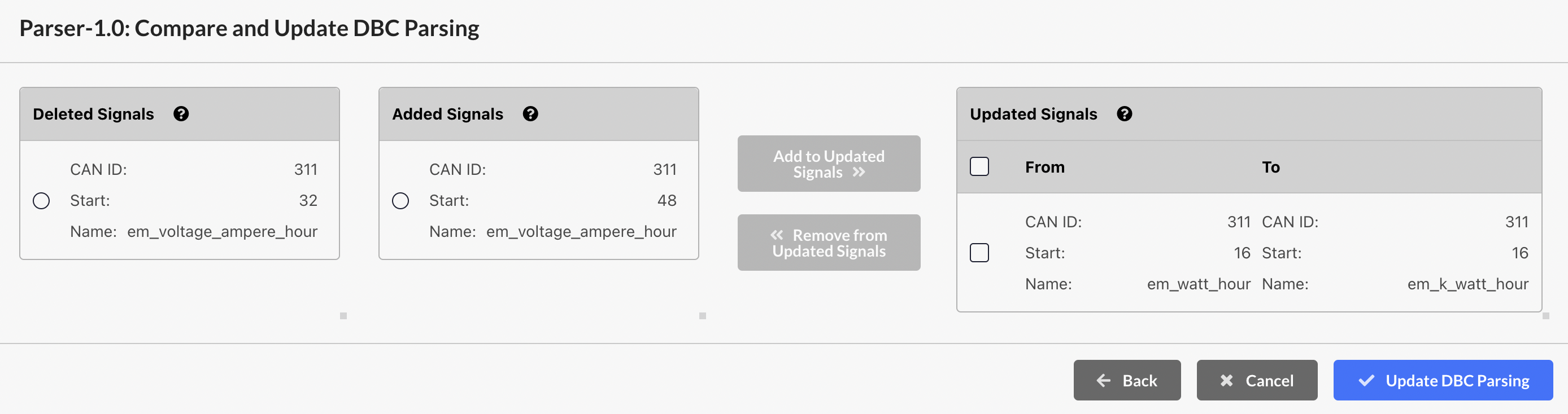
- DBC File Upload: Users can now update the DBC by uploading a new DBC file and comparing it against the existing one.
- Signal Comparison: Current DBC file will be compared with the uploaded new DBC file and automatically differences will be categorized into three distinct categories:
- Added Signals: Lists signals that are present in the new DBC file but not in the old one.
- Deleted Signals: Lists signals that were present in the old DBC file but are missing in the new one.
- Updated Signals: Shows signals that exist in both files but have changed attributes.
- Custom Modifications: Users can manually adjust signals between these categories (e.g., Select a signal from Added and Deleted category and then transfer it to the Updated category)
- Note: Parser cannot be updated while it is in a running state. You must stop the parser before starting any update.
Latency Histogram
We are displaying the **Latency Histogram **now for any action. This histogram represents various states such as Scheduled, Queued, In Progress, etc. The x-axis shows time in milliseconds, while the y-axis indicates the number of devices, providing a visual distribution of how long devices spent in each specific state.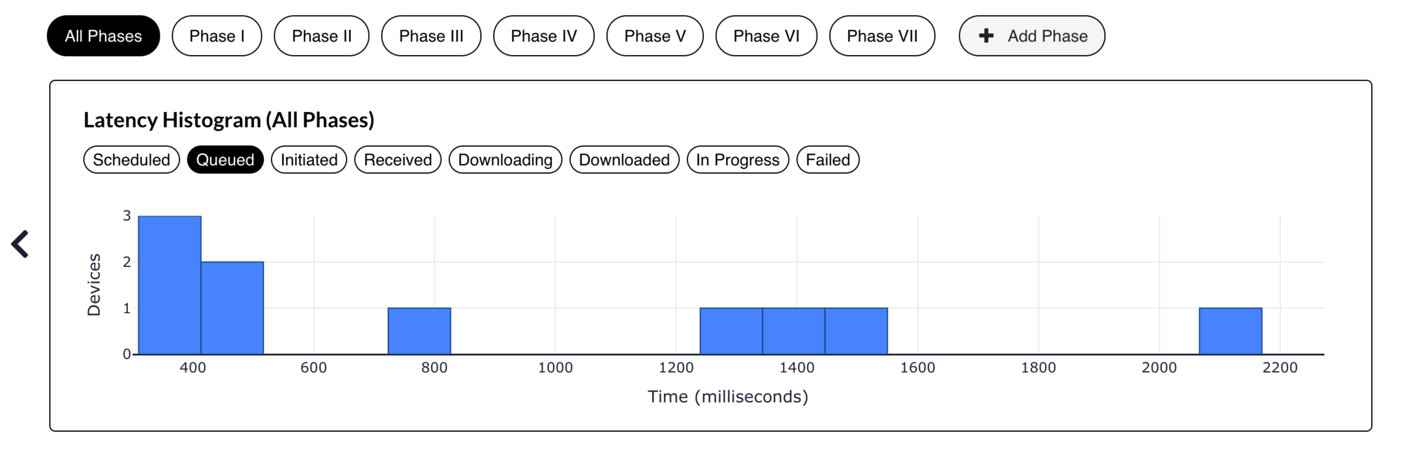
Line Chart Raw Data Download
We’ve provided an option to download the raw data from line charts. Now, you can download the data for various streams in **CSV **and **XLSX **formats, enabling seamless data export and analysis directly from the chart view.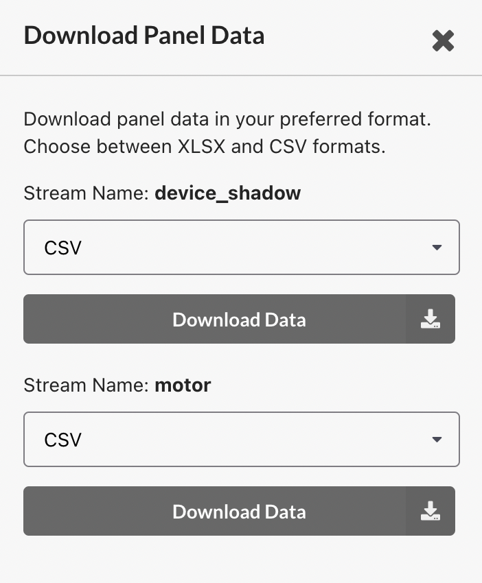
Minmax Aggregate
We’ve provided a Minmax option in the aggregate dropdown for the line chart. This feature allows you to visualize the minimum and maximum values of data points within each aggregation interval across the selected range, providing a clearer understanding of data variation and extremes.Clone Roles
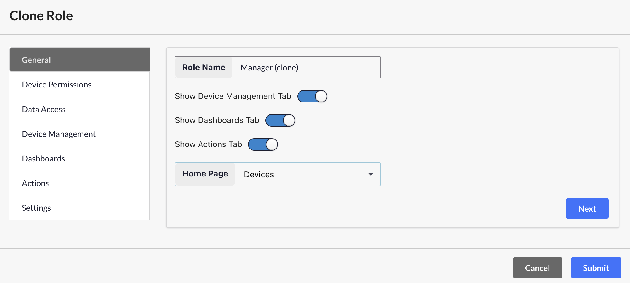
We’ve introduced the option to clone an existing role and customize it to meet specific requirements. The cloned role can then be assigned to users, granting them access based on the permissions defined within the role.
Bug fixes & Minor changes
- ⏱ Device-Level Timeouts: Implemented timeouts for actions at the device level.
- 📜 Action Logs View: Added the option to view action logs directly on the Action Details page.
- 📊 Threshold Options for Line Charts: Added both upper and lower threshold settings for line charts.
- 🚀 Performance Improvement: Introduced a limit of 40 on the “Last Value Panel” columns to enhance performance. Existing dashboards with more than 40 columns will have to be updated or split into multiple last value panels.